
If you are in the Interior design industry you may be wondering what is coming up next year for the style conscious fabric houses. Here is summary of some of the colours and trends that are due to emerge in the coming months.
Alongside their 3 colour palettes for next year the people at Pantone have finally revealed the colour of the year for 2019 as Living Coral 16-1546. Whilst we are still embracing the 2018 Ultra Violet with its futuristic appearance, this colour is warm and lively and evokes feelings of optimism and joyful activities. Pantone have also released 3 other palettes of colour called Cravings, Meanderings and Classico.
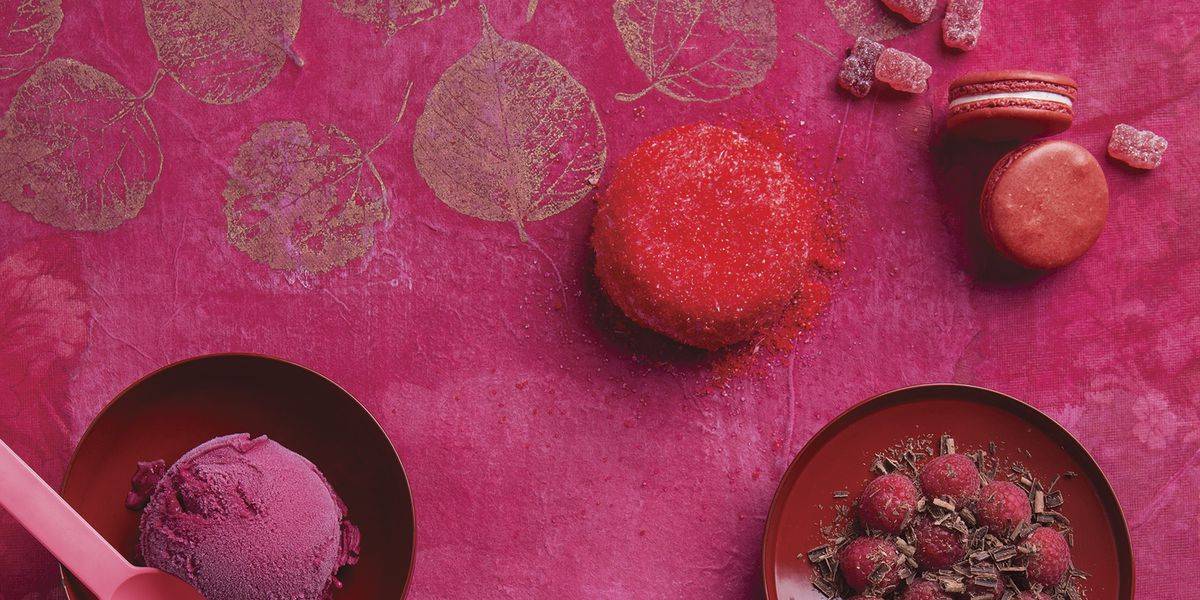
“CRAVINGS, THE 2019 PANTONE PALETTE DEDICATED TO FOOD Among the colours we find: Butterum, Cappuccino, Chili Pepper, Flamingo, Grass Green, and Cayenne.” -Pantone
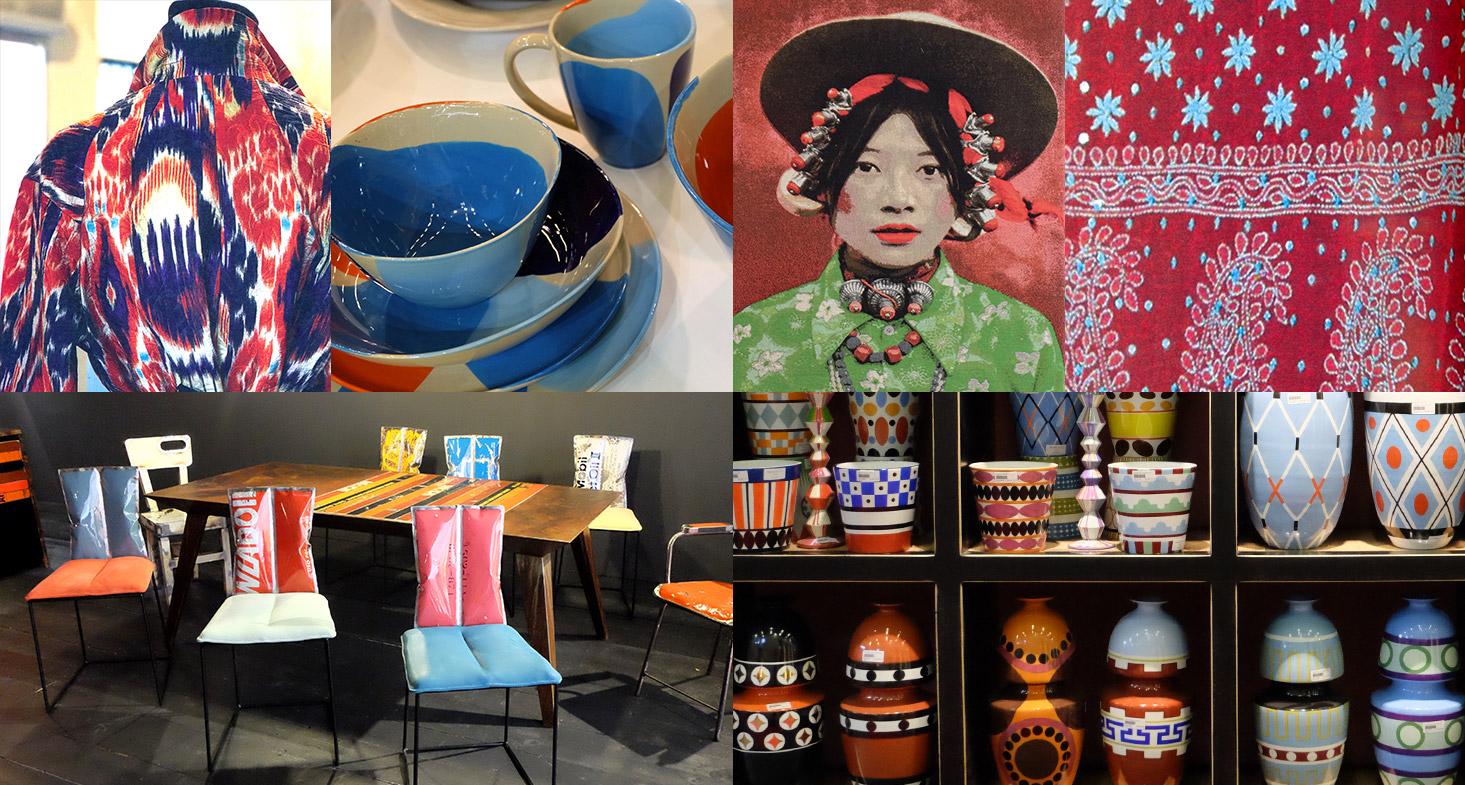
“MEANDERINGS, THE 2019 PANTONE PALETTE OF GLOBALISATIO Among the colours included are: Island Green, Blue Print, Spice Route, Chai Tea, Aurora Red and Wild Orchid.” -Pantone
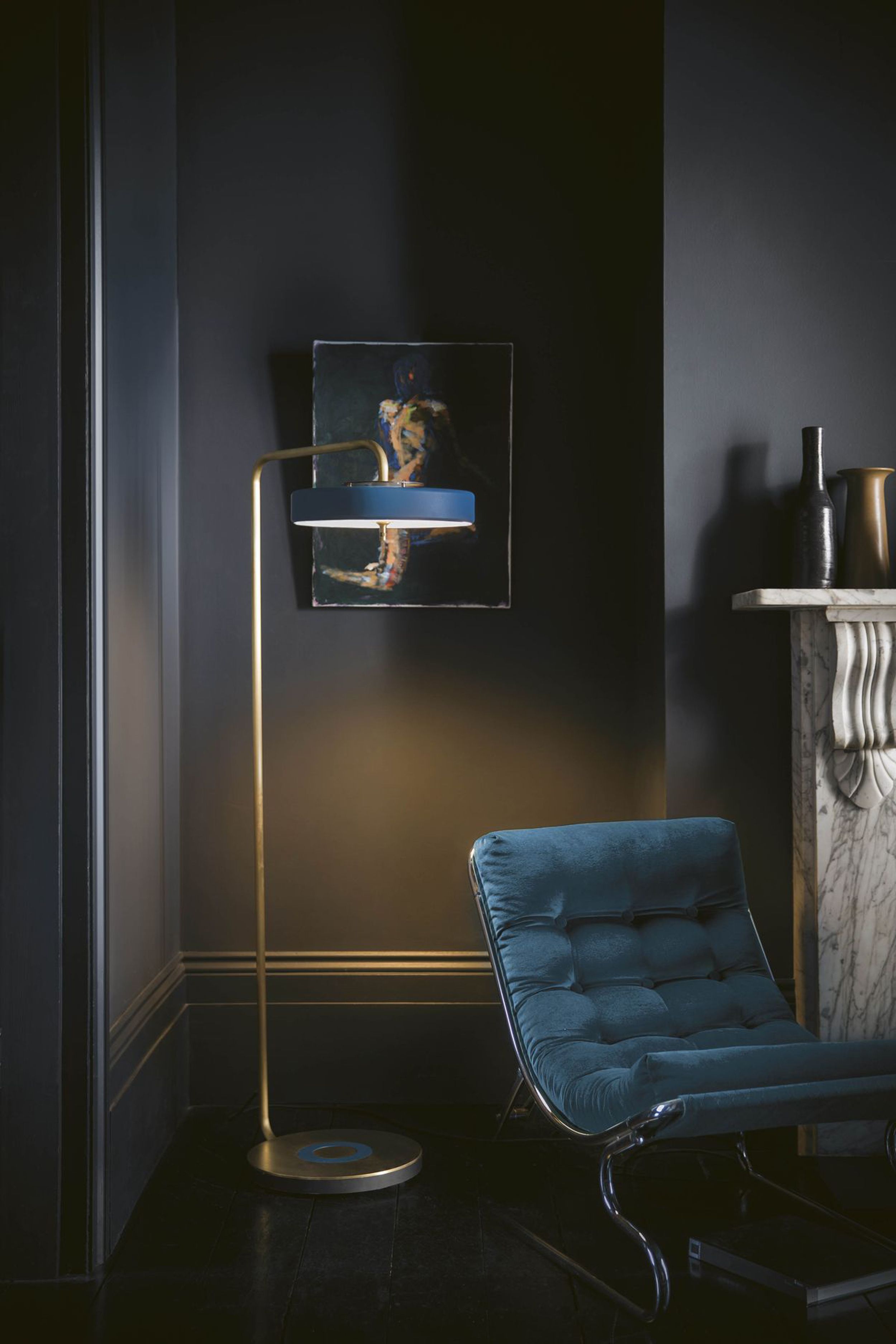
“CLASSICO, THE 2019 PANTONE PALETTE OF TIMELESS COLOURS
Just as the name suggests, the shades of the Pantone Classico palette are essential, sober and timeless and at the same time, elegant and always in fashion. Among the colours included in Classico – Pantone Colour Palette 2019 here are: Camel, Deep Teal, Apricot Brandy, Gray Flannel, White Swan, and Caviar.” -Pantone
PANTONE COLOUR OF THE YEAR 2019

It is a move forward for the pastel pinks that have been everywhere this year. Mixed
with eastern influences from Morocco and teamed with coastal blues and greens, this
colour has the potential to liven up the dullest of spaces. Think tiled flooring, hand-dyed linens, layers of patterns, water colour prints all mixed together to give a fresh and elegant take on the pink trend.
RELAXED NORDIC STYLE
This style embraces the best of Swedish hygge. Walls in shades of white contrasted by rough wood surfaces and sheepskin rugs.

AT ONE WITH NATURE
Sustainability is becoming a global priority. Ethically sourced products, natural fabric and textile designs that mimic natural materials are a big trend for 2019.

NIGHTWATCH GREEN
This Dulux colour of the year is Nightwatch Green. A strong colour that creates a dramatic effect when teamed with blossoming florals and bright oranges. This colour works with the botanical theme that has been really popular this year.


SUMPTUOUS VELVET
Internet searches for velvet has increased 400% in the past 6 months as people are looking for luxurious investments in bold contrasting colour fabrics.
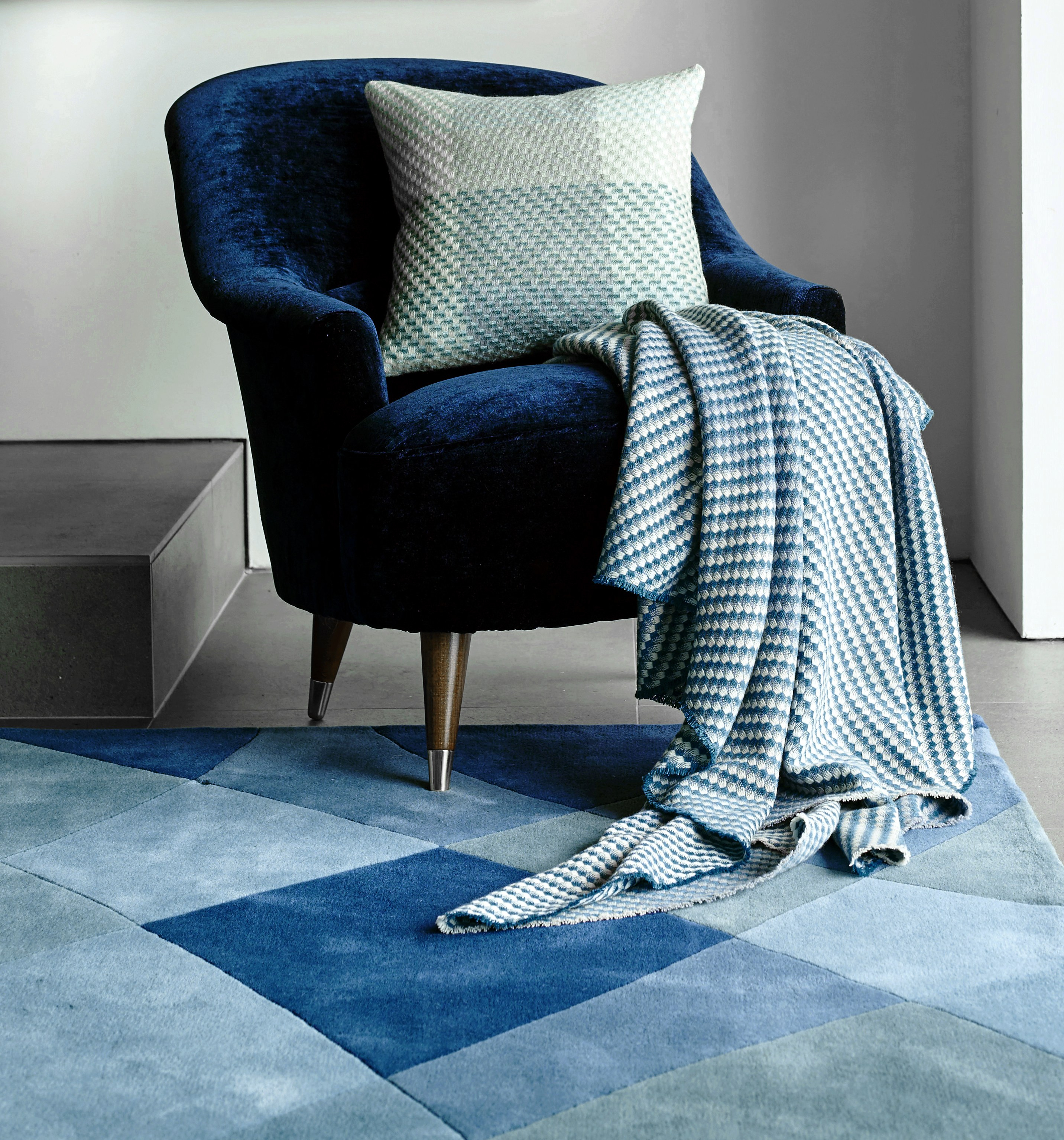

INSPIRED BY 70’S RETRO
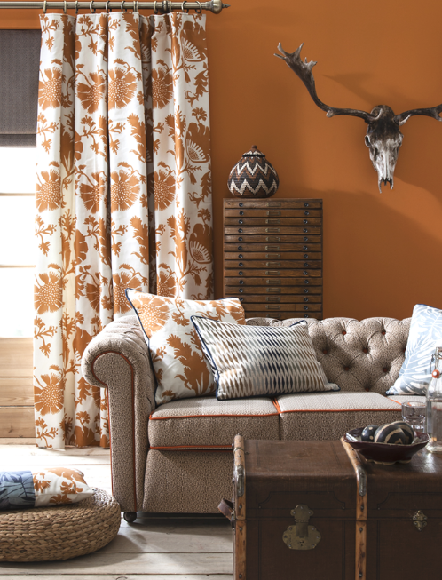
With the current trend for velvet and bold geometric patterns, and so many burnt oranges and yellows at the forefront of the consumer trends, there is definitely a nod towards the 70’s era. Think warm colour palettes, funky textures and abstract silhouettes.

BLACK & WHITE
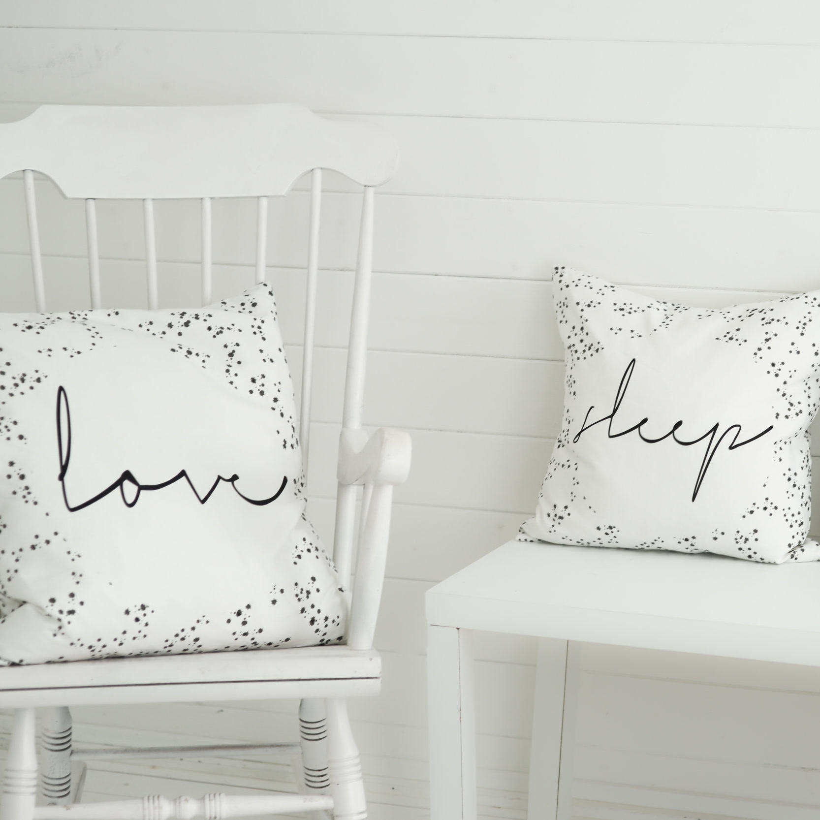
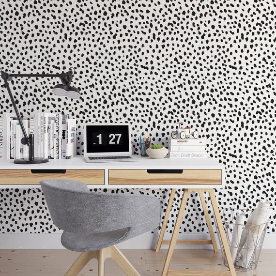
A truly timeless design trend, the visual contrast of black and white provides a sense of balance and boldness. Look out for dalmatian print which will be everywhere next year.

Images from; Pantone, Dulux ,Claire Gaudion, Prestigious Textiles, Green & Mustard, The Haddow Group, West Elm, The Room Alive and Etsy.


